 Af Kurt Menke
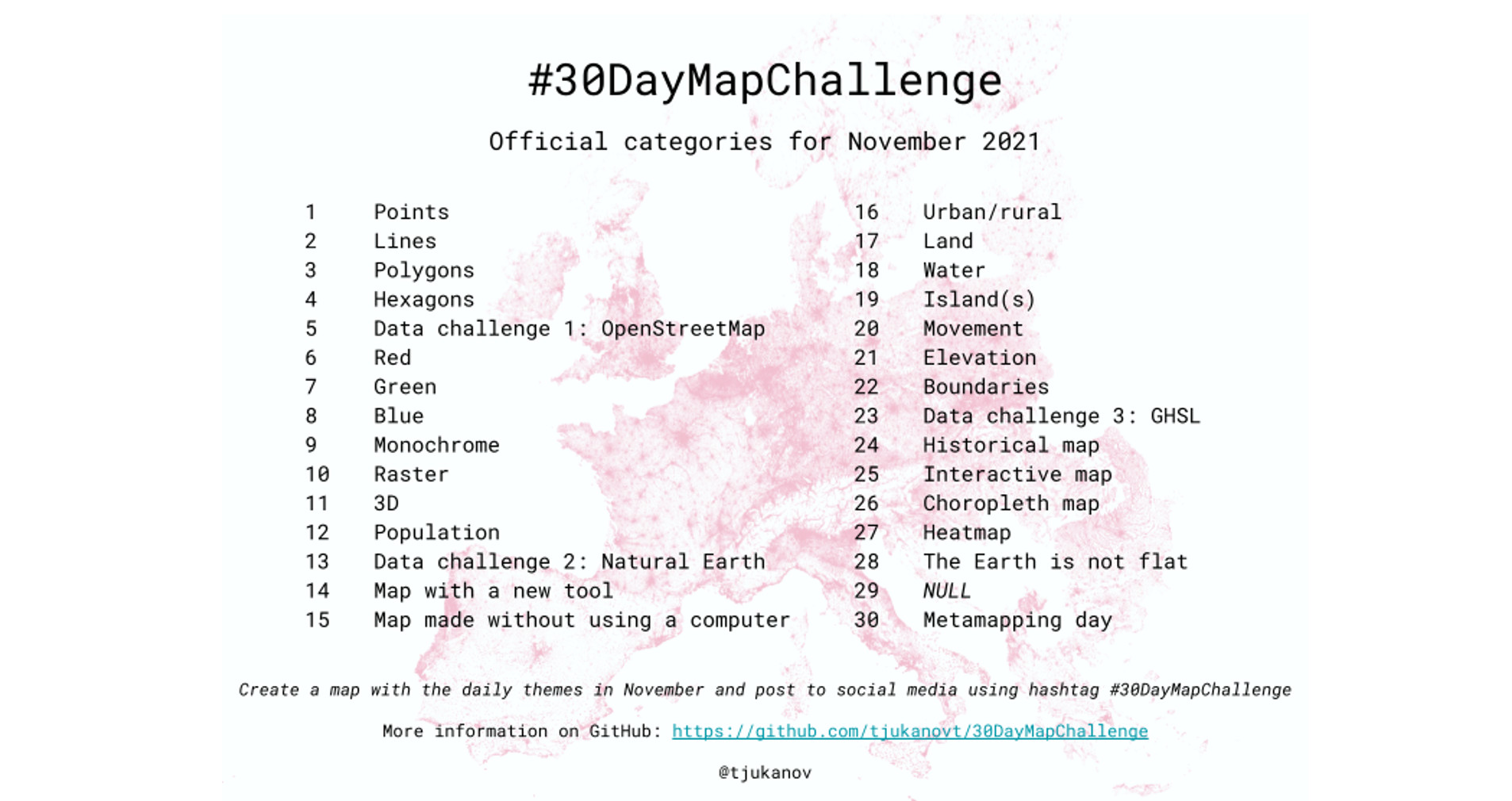
Several years ago Topi Tjukanov developed the 30 Day Map Challenge. It takes place during the month of November. Each day has a theme. The challenge is to produce a map each around that theme and post it to social media with the #30DayMapChallenge hash tag. Importantly it is not a competition and there are no winners. It is about creativity and openness.
This year I committed myself to completing the entire challenge, with a focus on Denmark. It was not always easy to find the time, but it was a lot of fun, and I learned more mapping tools and discovered new datasets! In this year’s challenge, over 9000 maps were produced, by 1200+ cartographers from 90 countries! Next year I hope there are more Danish entries!
Instructions for the final day were to spend the day either by 1) collecting your entries from the challenge to a common gallery, 2) writing a tutorial or a blog post on one of your maps or 3) create a map from a theme you have chosen yourself. So I present my results here! I produced 90% of them using QGIS and all with open source software.
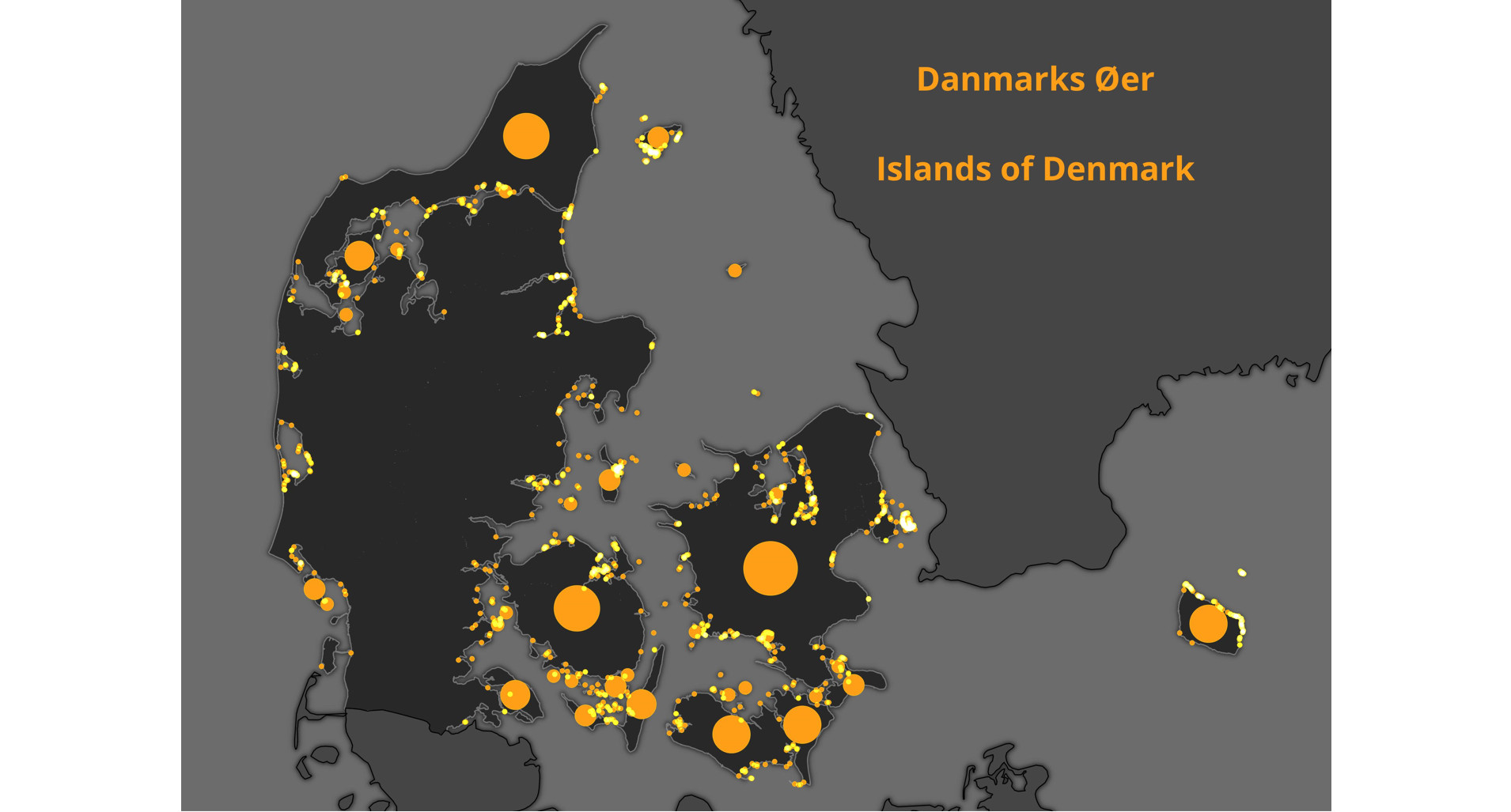
Day 1: Points
For the first day, I computed the centroid of all Denmark’s islands.
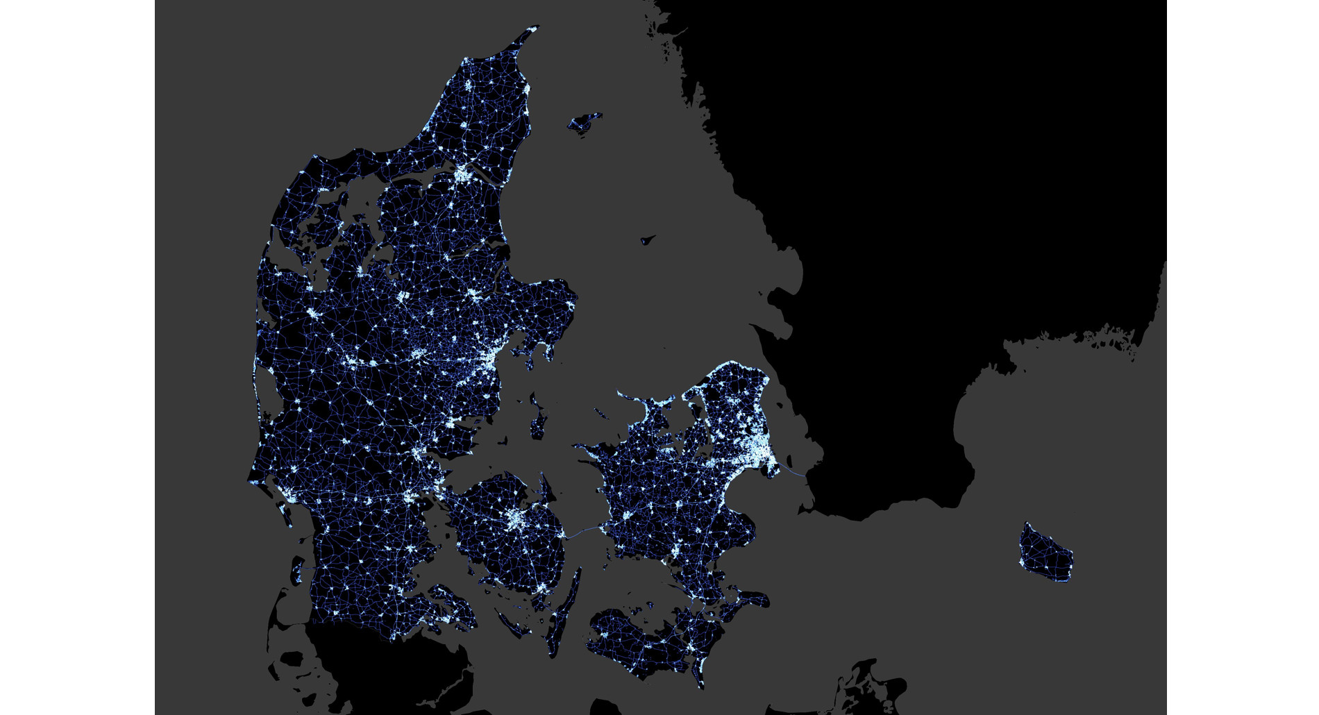
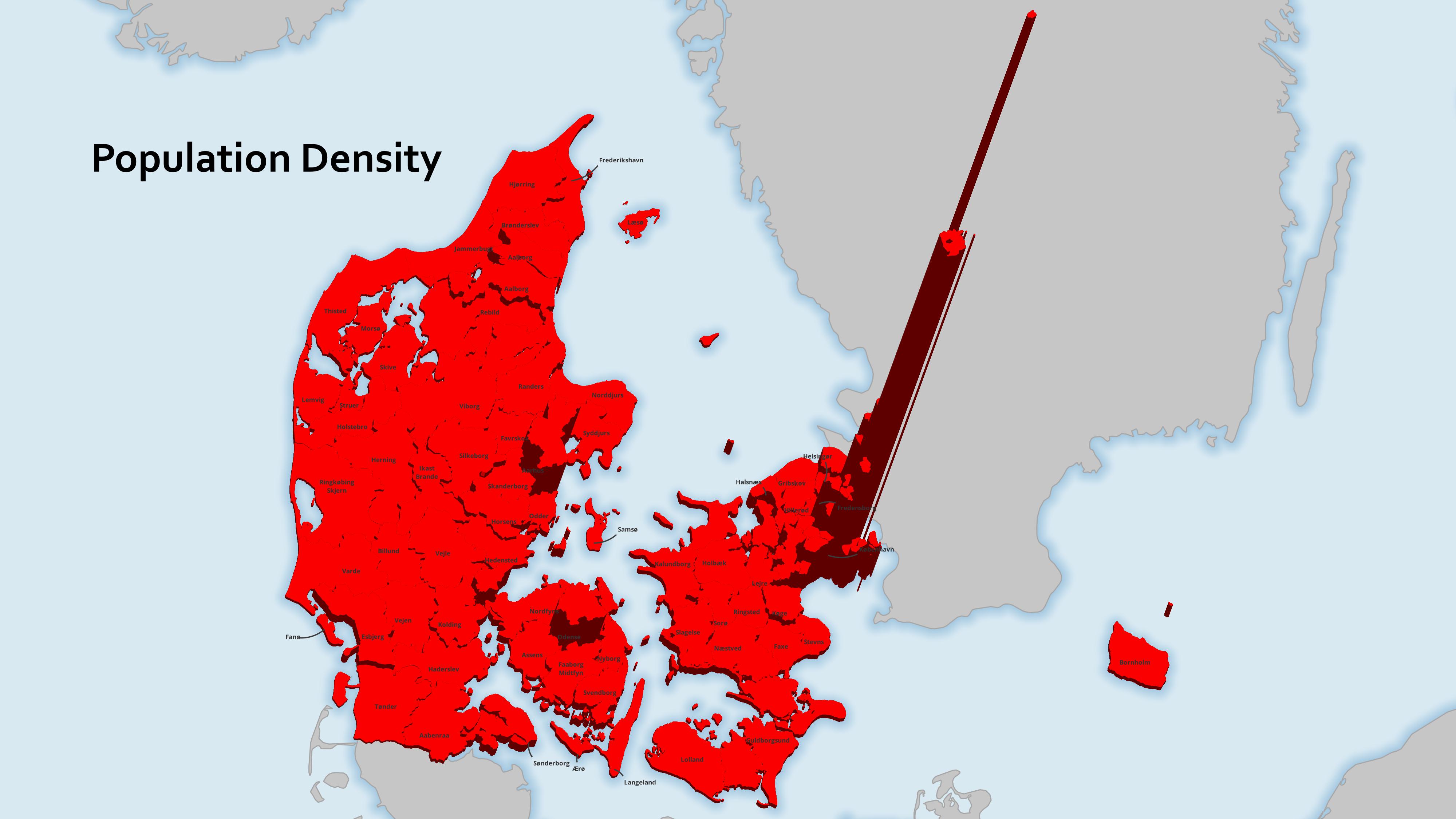
Day 2: Lines
For lines, I made a map of the Roads of Denmark styled with a Feature Blending Mode of Addition. This is a way to show road density.
This technique is covered in my Data Visualization with QGIS course offered next February.
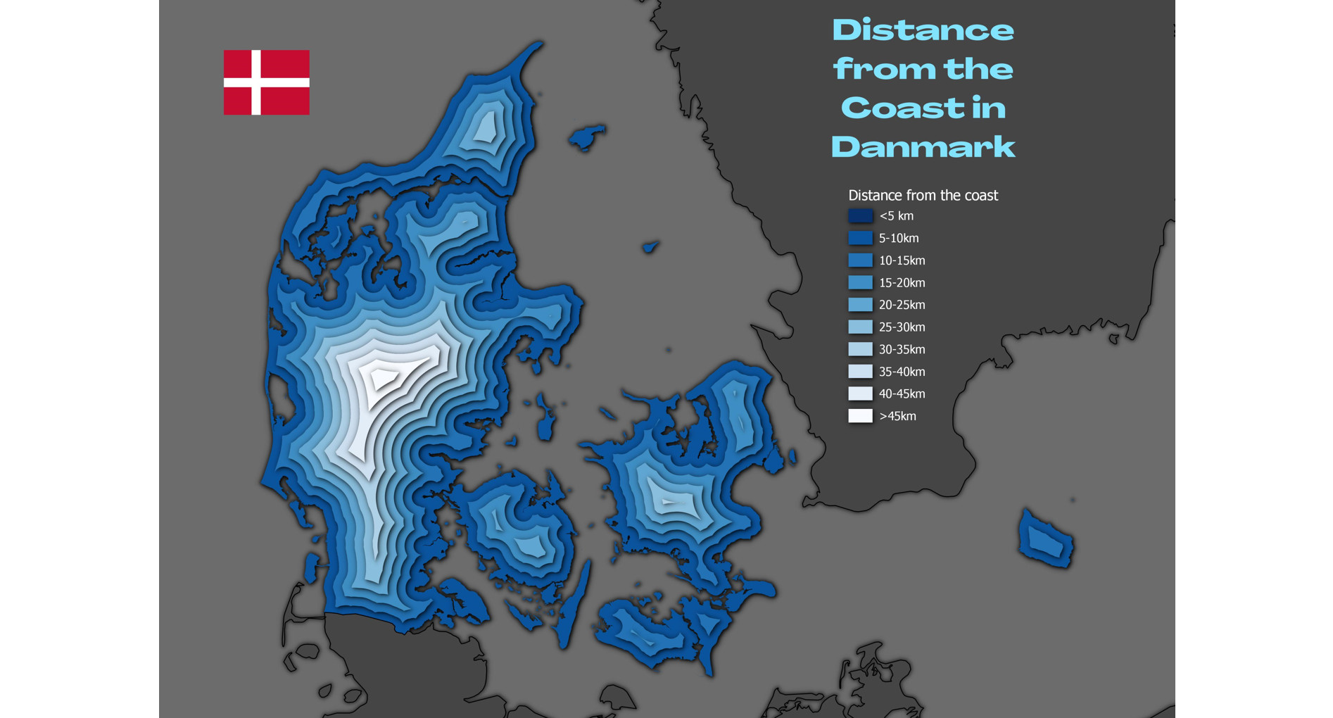
Day 3: Polygons
For polygons, I was inspired by how close to the sea you are anywhere in Denmark.
So I created a series of internal buffers, and then applied a Drop shadow to them at the feature level.
Live layer effects are also covered in the upcoming Data Visualization with QGIS course.
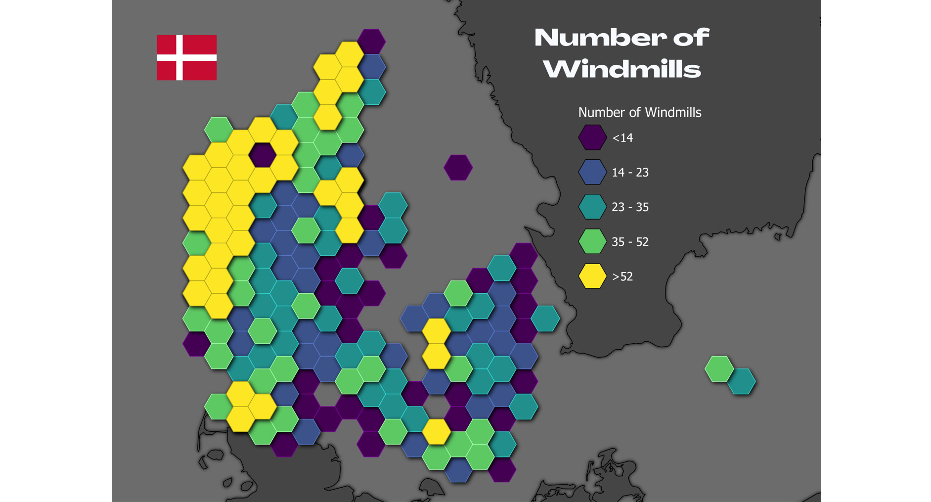
Day 4: Hexagons
Here I mappped the number of windmills in Denmark by hexagons. The data came from GeoDK.
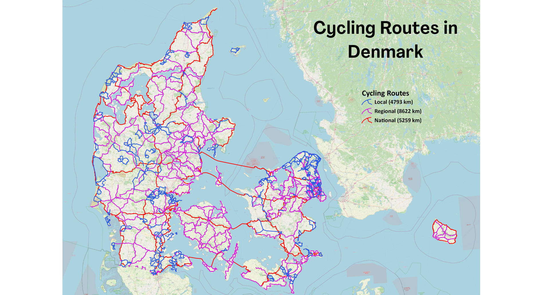
Day 5: Data challenge 1: OpenStreetMap
Here the challenge was to Use OSM to map something that is interesting to you.
So I mapped cycling routes in Denmark. I obtained Denmark wide OSM data from Geofabrik and extracted the routes using OSMFilter.
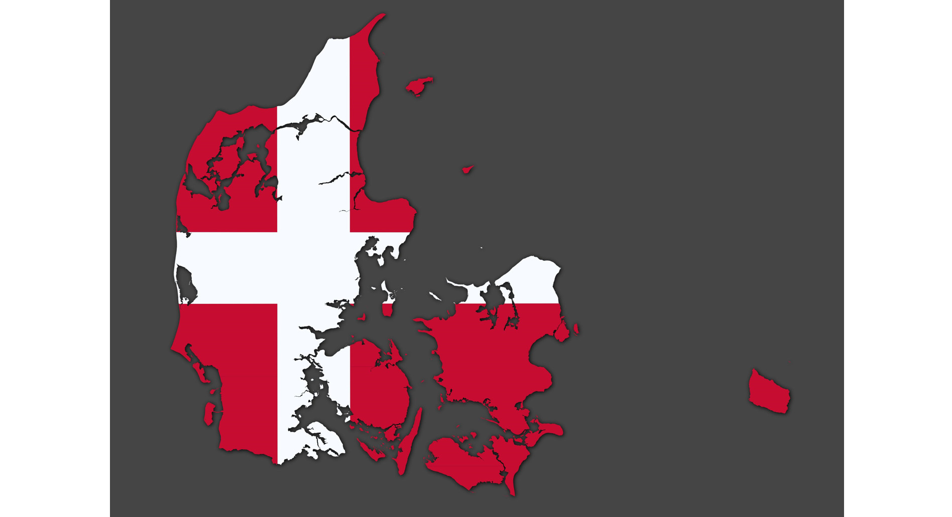
Day 6: Red
With this theme, a Dannebrog map of Denmark seemed the obvious choice :)
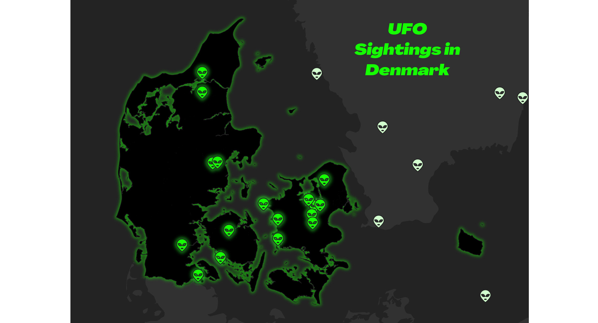
Day 7: Green
UFO Sightings in Danmark.
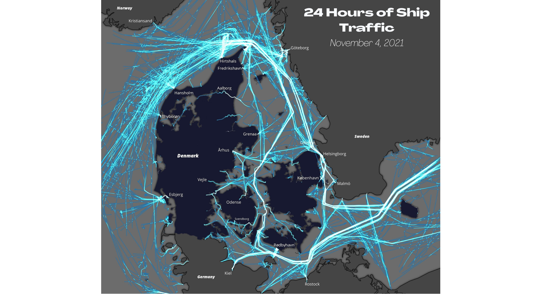
Day 8: Blue
24 hours of ship traffic around Denmark. I generated the tracks from 9 million AIS data points from 4.November, 2021. I obtained the data from the Danish Maritime Authority
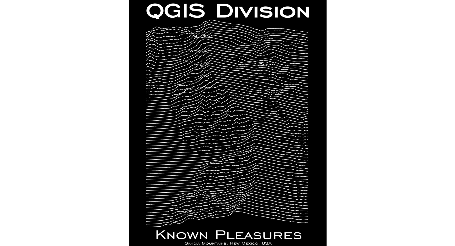
Day 9: Monochrome
A monochromic image is composed of one color (or values of one color). So for example black and white maps are valid here.
So here I created a joy ploy of the of the mountain range where I used to live - the Sandia Mountains outside of Albuquerque, New Mexico.
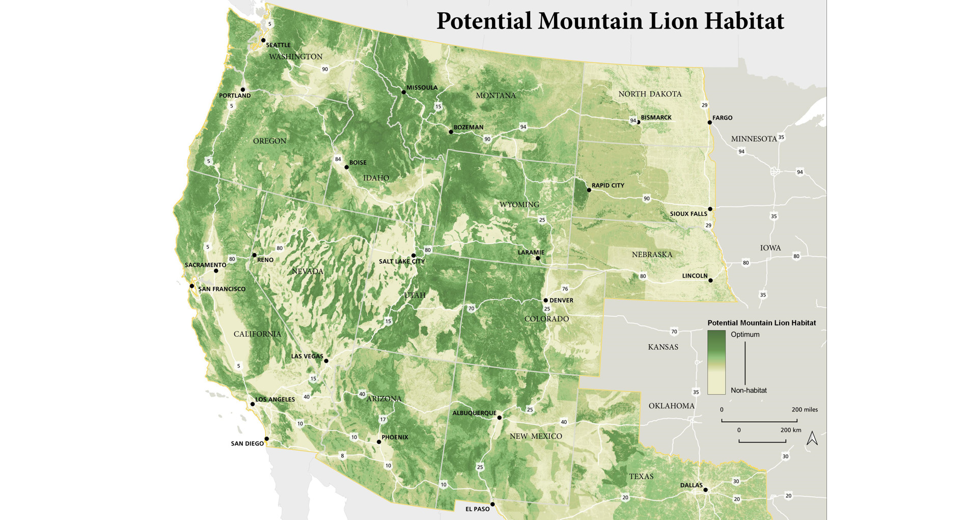
Day 10: Raster
A model I developed to show Potential Mountain Lion Habitat in the western US. There were some data challenges in matching disparate data sources for inputs (the “meat map”) that caused some visible borders in the east. But overall I am happy with it.
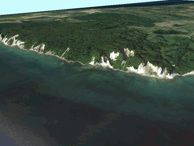
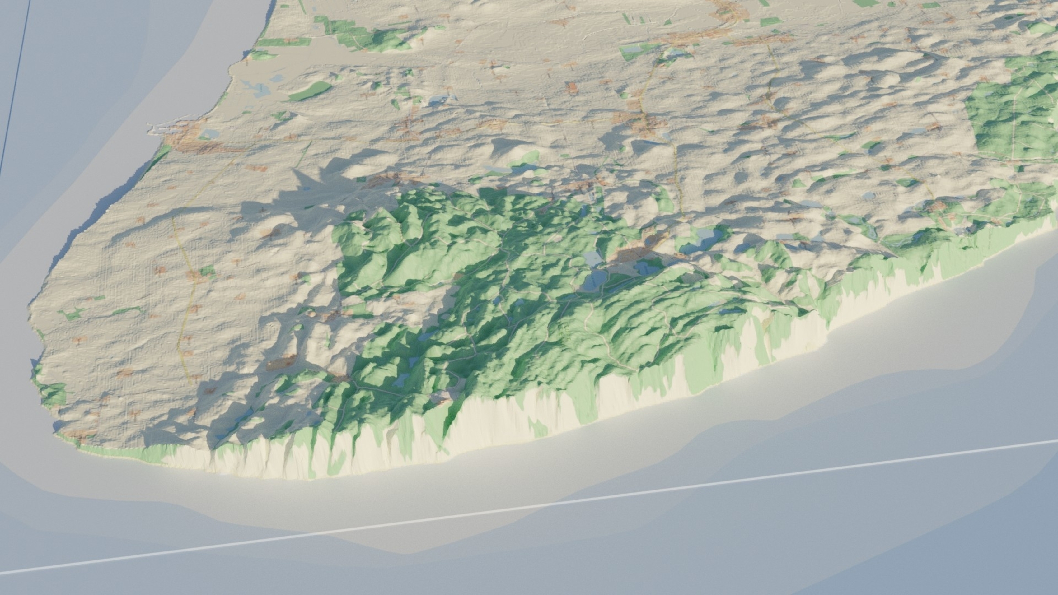
Day 11: 3D
Møns Klint in 3D from the Danish height model. This topic is covered in the upcoming Data Visualization with QGIS course.
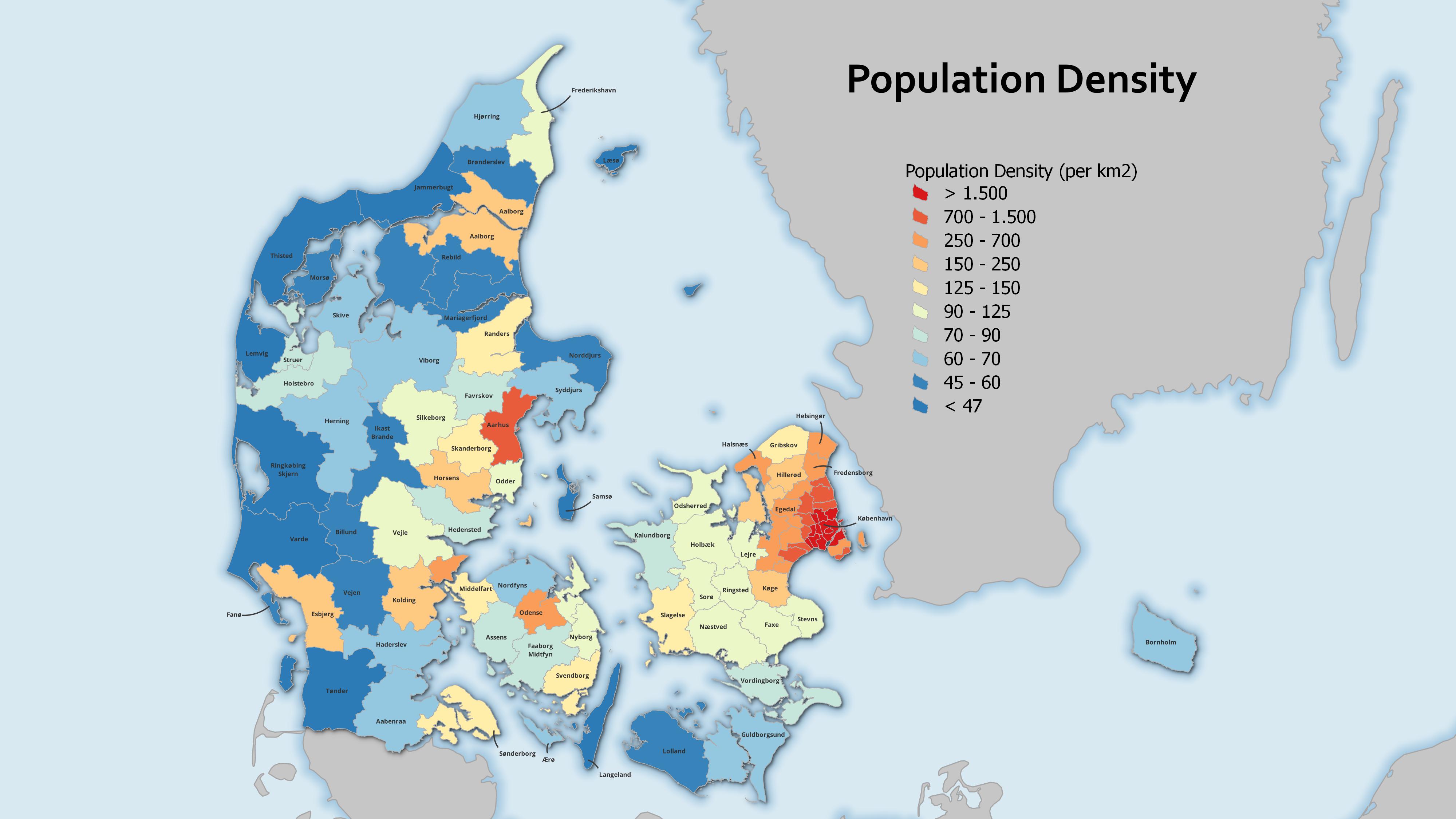
Day 12: Population
Here I played with extruding the population density of Denmark by Kommune into 3D space.
I also produced a standard choropleth version
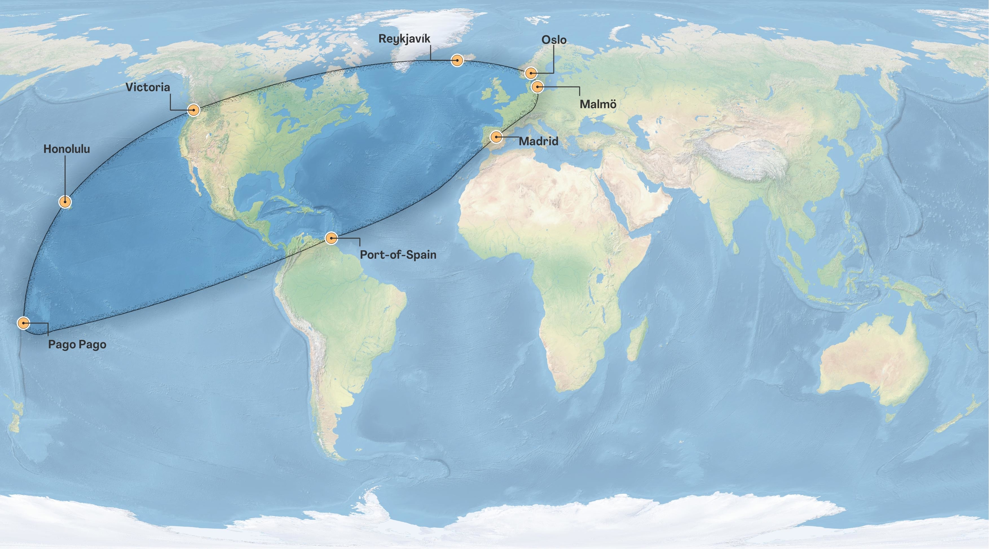
Day 13: Data challenge 2: Natural Earth
Natural Earth data is a great public domain map dataset for cartography on global and national scales. On this day I used it to create my personal bounding box. The polygon of where I have travelled on planet Earth.
Day 14: Map with a new tool
I have always wanted to learn Blender. So I created this quick view of Møns Klint, Denmark with an OSM overlay. Could spend a lot more time on it, but for a quick effort I am pretty pleased.
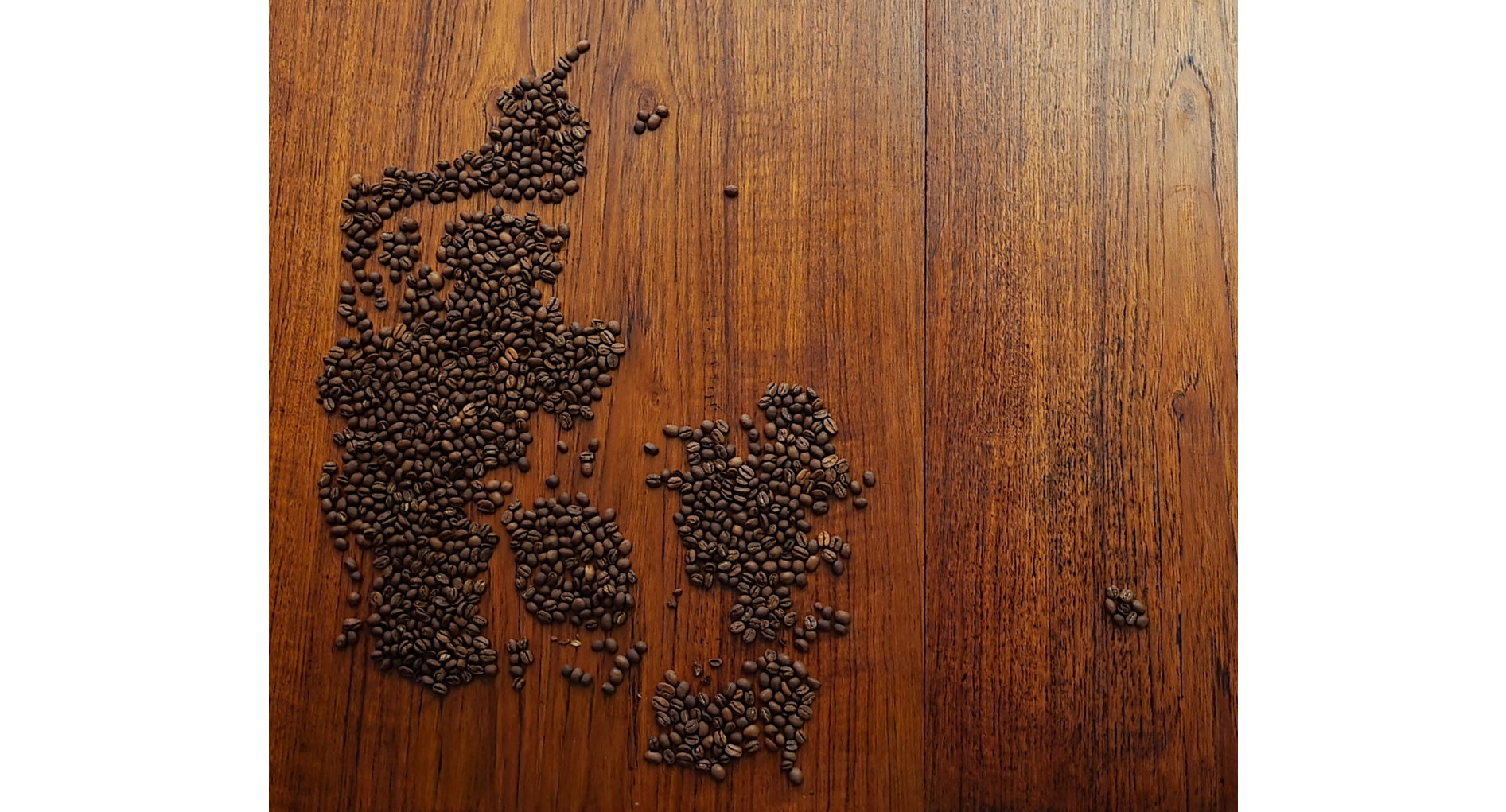
Day 15: Map made without using a computer
My wife and I teamed up to make this map of Denmark on our dining room table out of coffee beans.
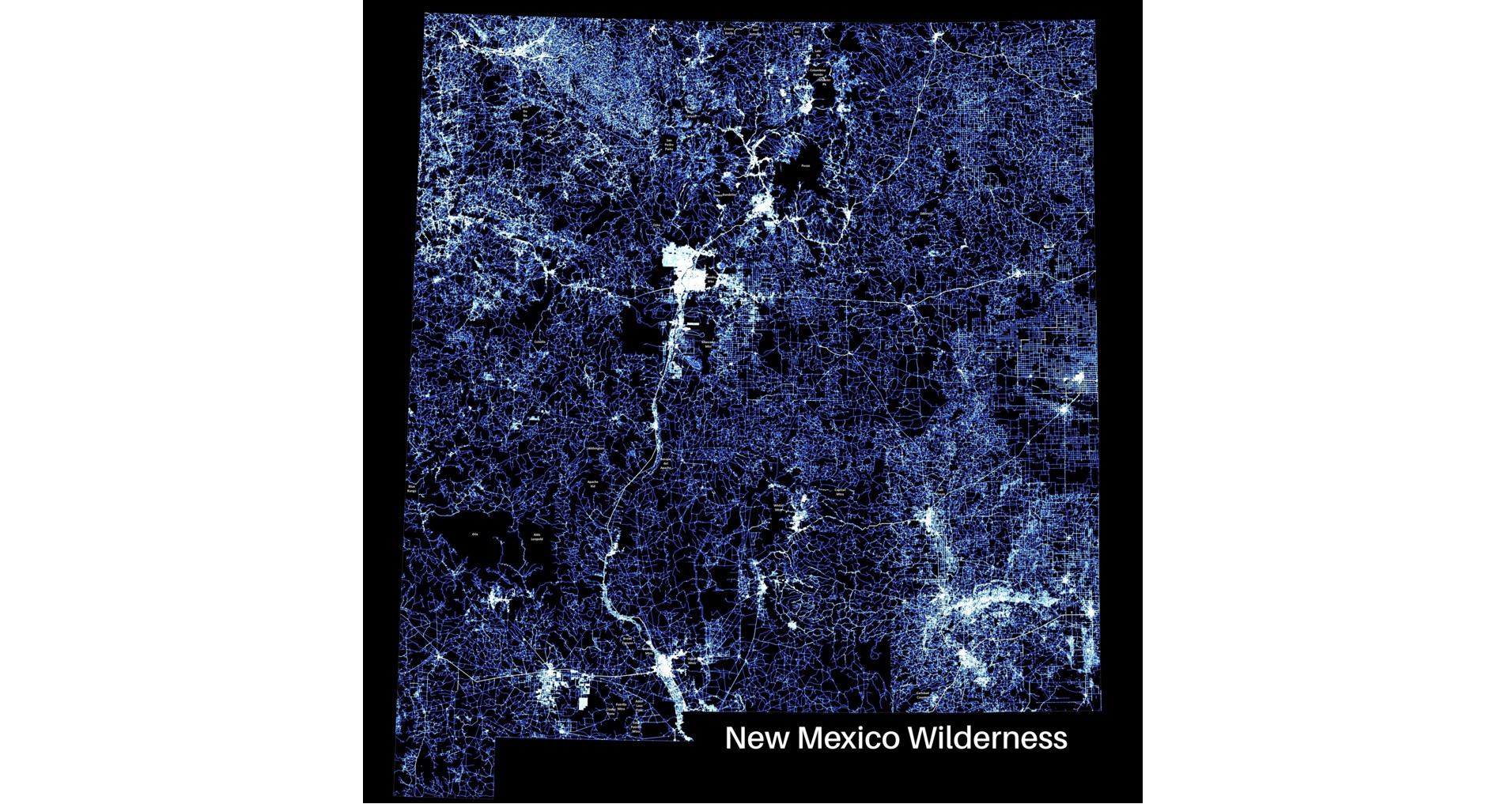
Day 16: Urban/rural
Showing the state I used to live in - New Mexico and Wilderness. Here wilderness areas are shown as holes in the road network, labeled with the Wilderness name. It shows how little intact landscape remains.
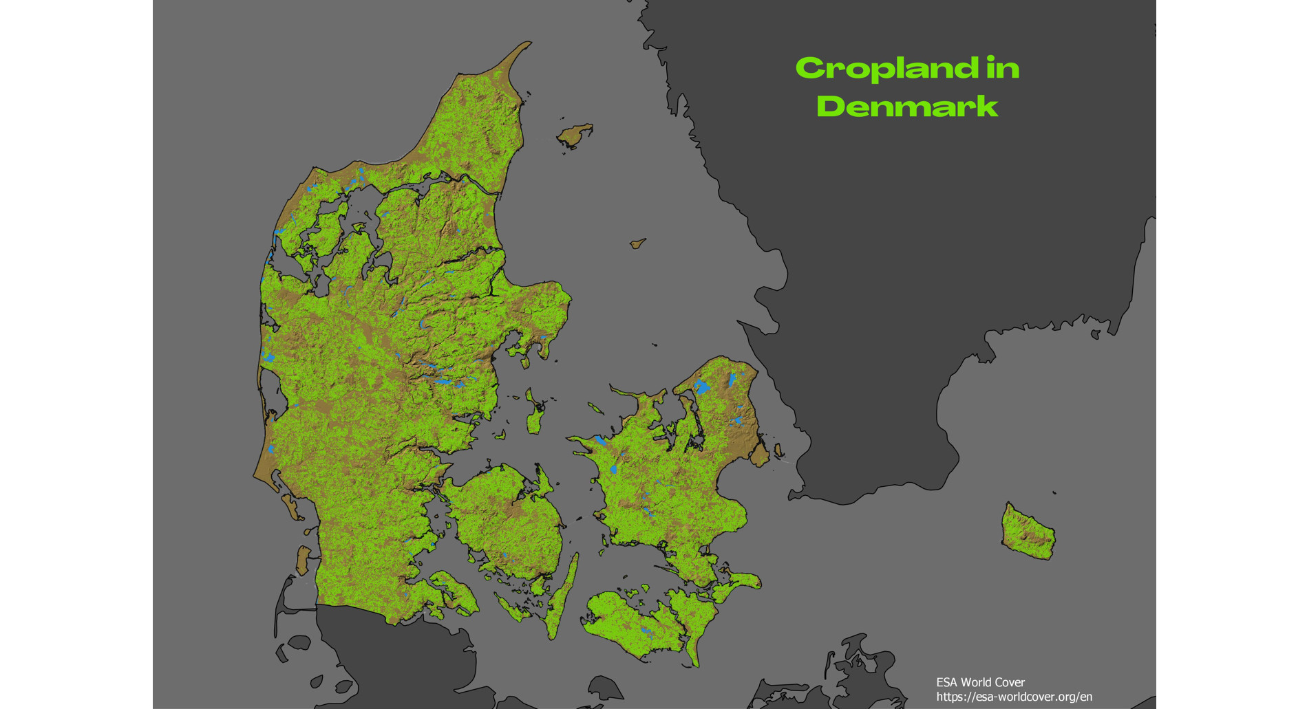
Day 17: Land
Croplands of Denmark - data from ESA Worldcover. You can learn to work with this type of raster data in the upcoming Raster data and analysis in QGIS course.
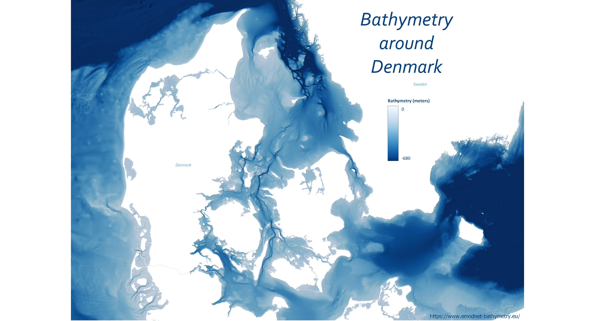
Day 18: Water
Bathymetry around Denmark - data from EMODnet
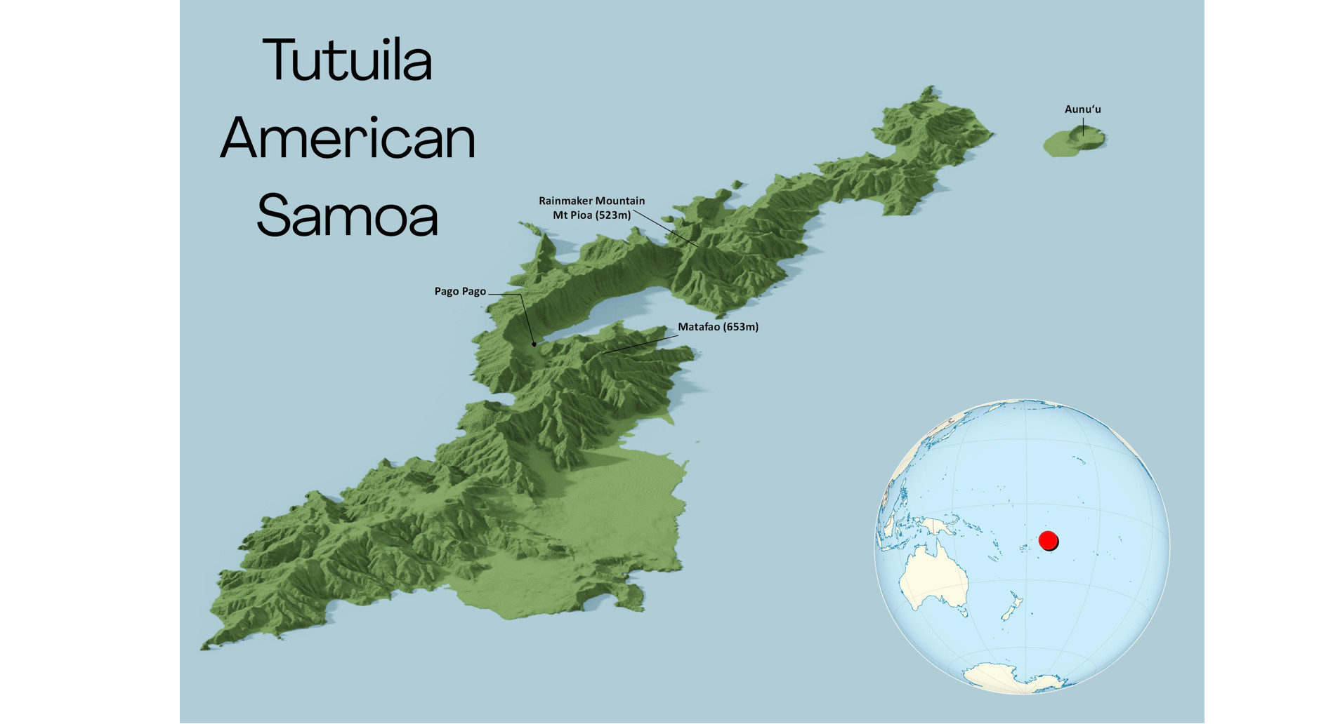
Day 19: Island(s)
Two years prior, just before the pandemic, I landed on Tutuila, American Samoa & taught a 3 day QGIS course to an amazing group of people at their Department of Health. I have never laughed so much teaching! It was a magical 33 x 3km mountainous island. I hope to return someday. Here I used another new tool - Aerialod, which I want to experiment with more!
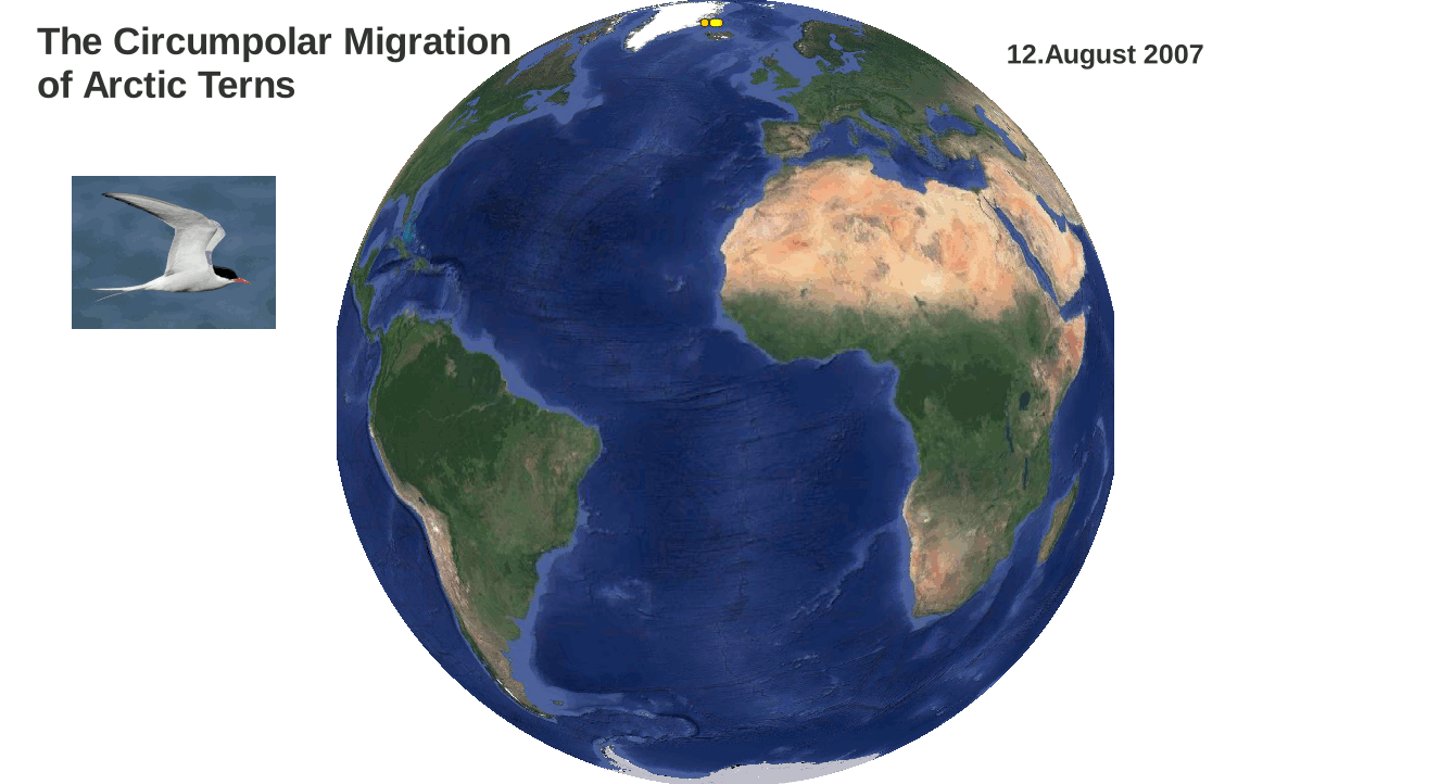
Day 20: Movement
Here I decided to show the circumpolar migration of Arctic Terns. They have the longest migration of any animal. I animated telemetry data using the QGIS temporal controller. This allows you to see just how rapidly they are able to fly from pole to pole - data from https://seamap.env.duke.edu/dataset/705 The QGIS Temporal controller will be covered in the upcoming Data Visualization with QGIS course.
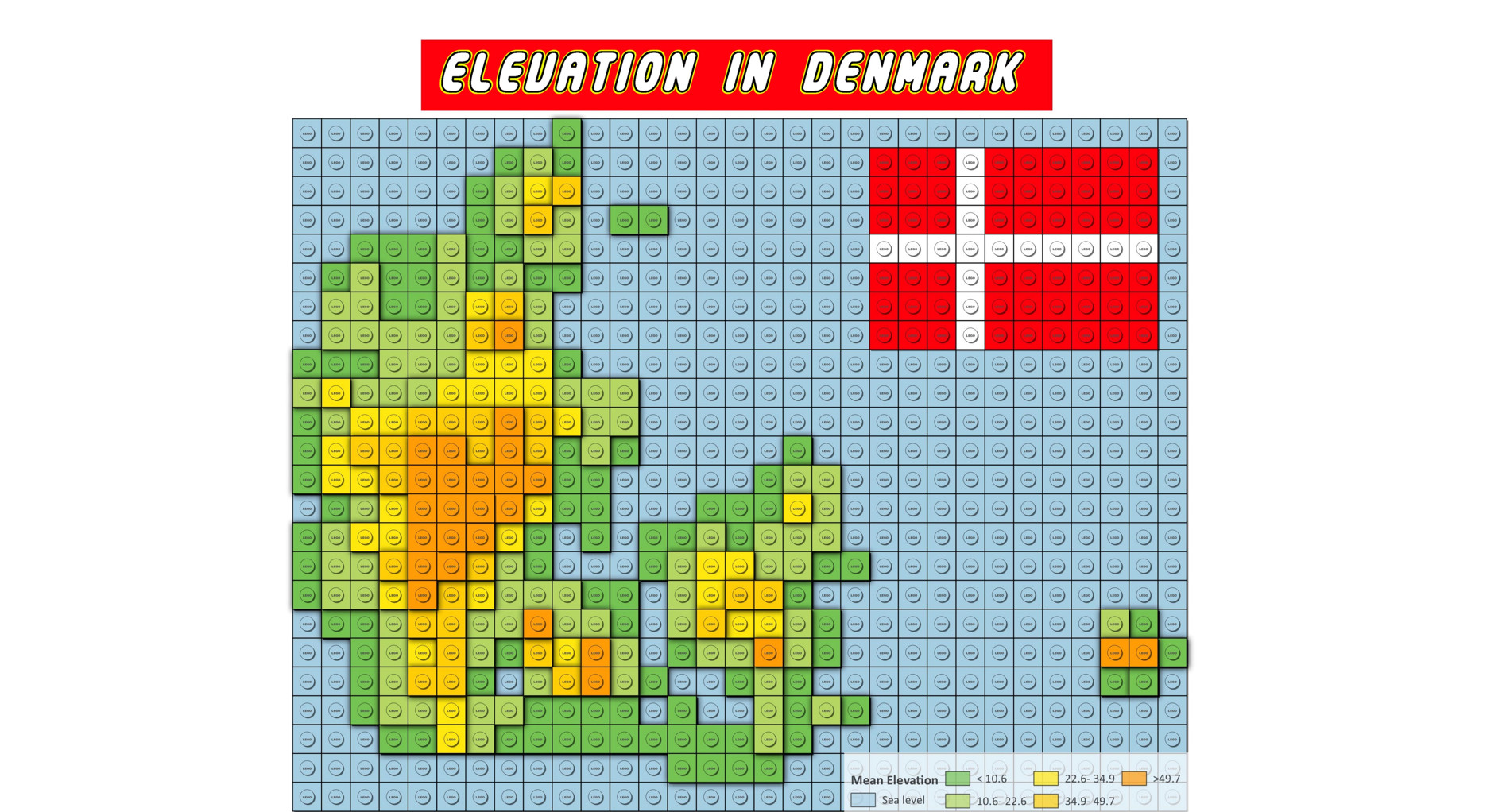
Day 21: Elevation
A Lego map of mean elevation in Denmark. I created the overall effect using Geometry generators in QGIS and finished it in GIMP.
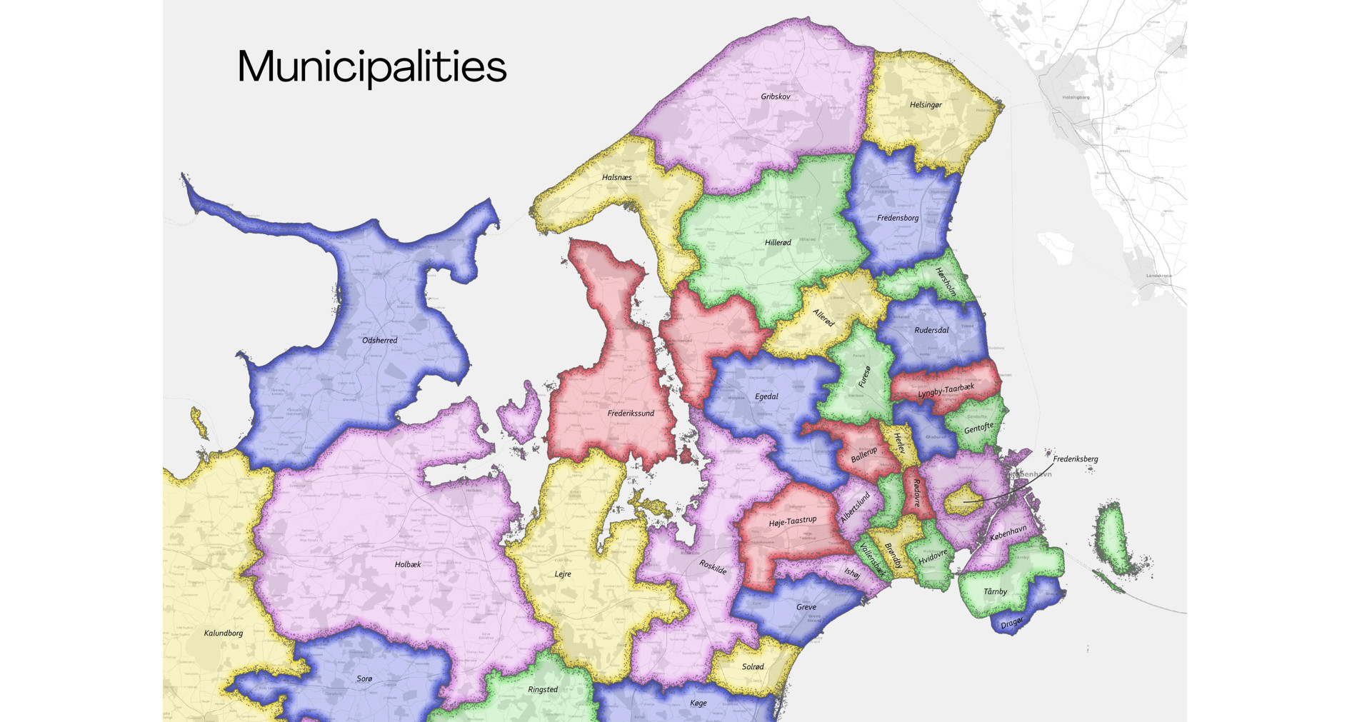
Day 22: Boundaries
Topologically colored Municipal boundaries (Kommune) for Denmark. This is a technique also taught in the upcoming Data Visualization with QGIS course.
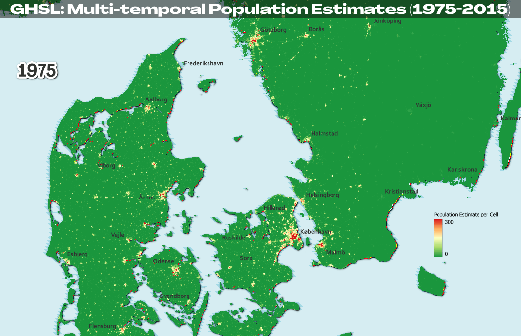
Day 23: Data challenge 3: GHSL
The third data challenge was to create a map using this great Global Human Settlement Layer (GHSL) dataset from the European Commission Joint Research Centre on human population. I made a temporal animation of Denmarks Population by cell from 1975-2015 using the QGIS Temporal Controller.
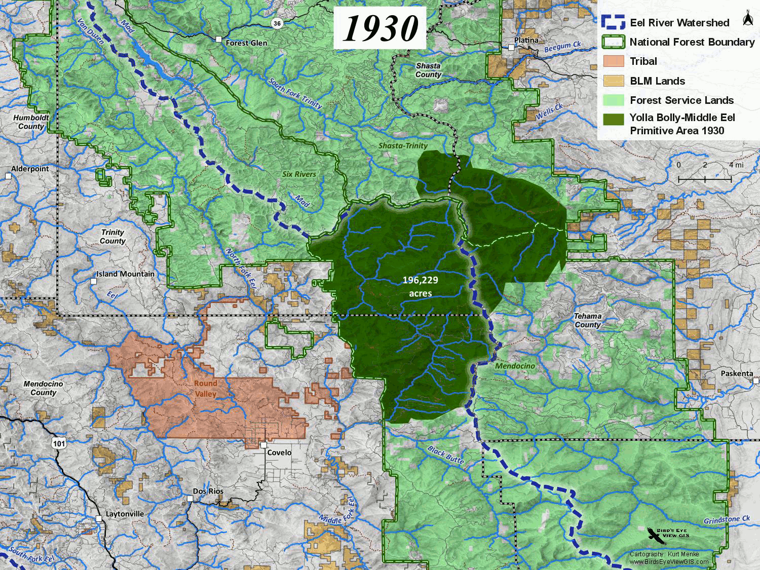
Day 24: Historical map
A temporal animation showing the evolution of the Yolla Bolly-Middle Eel Wilderness (California) since 1930.
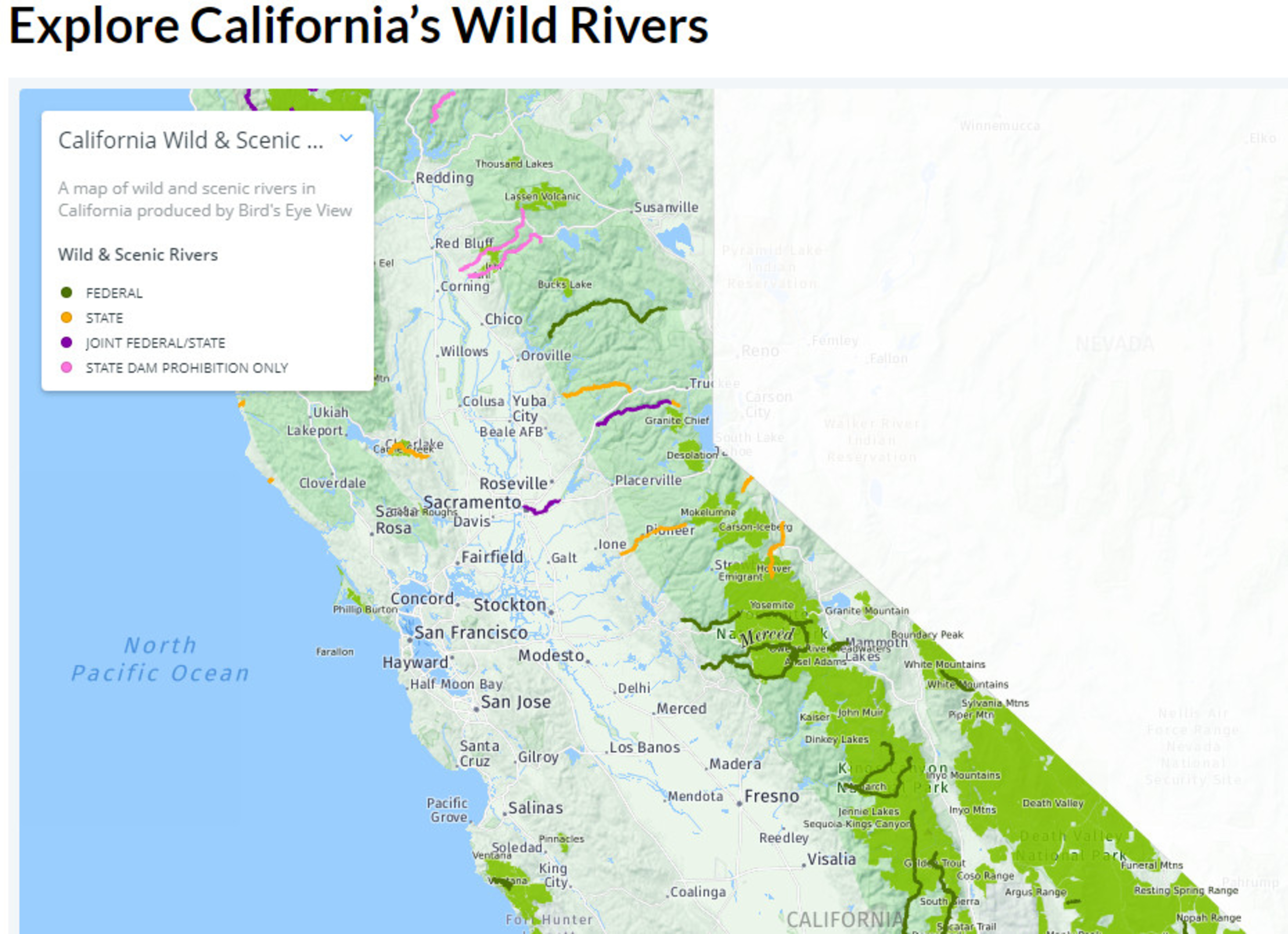
Day 25: Interactive map
An interactive map I built for the California Wilderness Coalition to explore California’s Wild & Scenic Rivers.
Day 26: Choropleth map
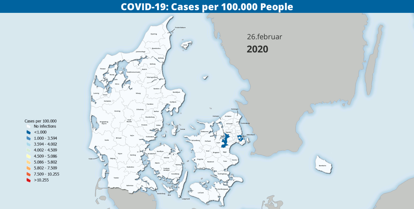
A temporal animation of the COVID-19 rate by Kommune in Danmark since the beginning of the pandemic through early November 2021.
This was produced from data maintained by the Statens Serum Institut and Danmarks Statistik using the QGIS Temporal Controller.
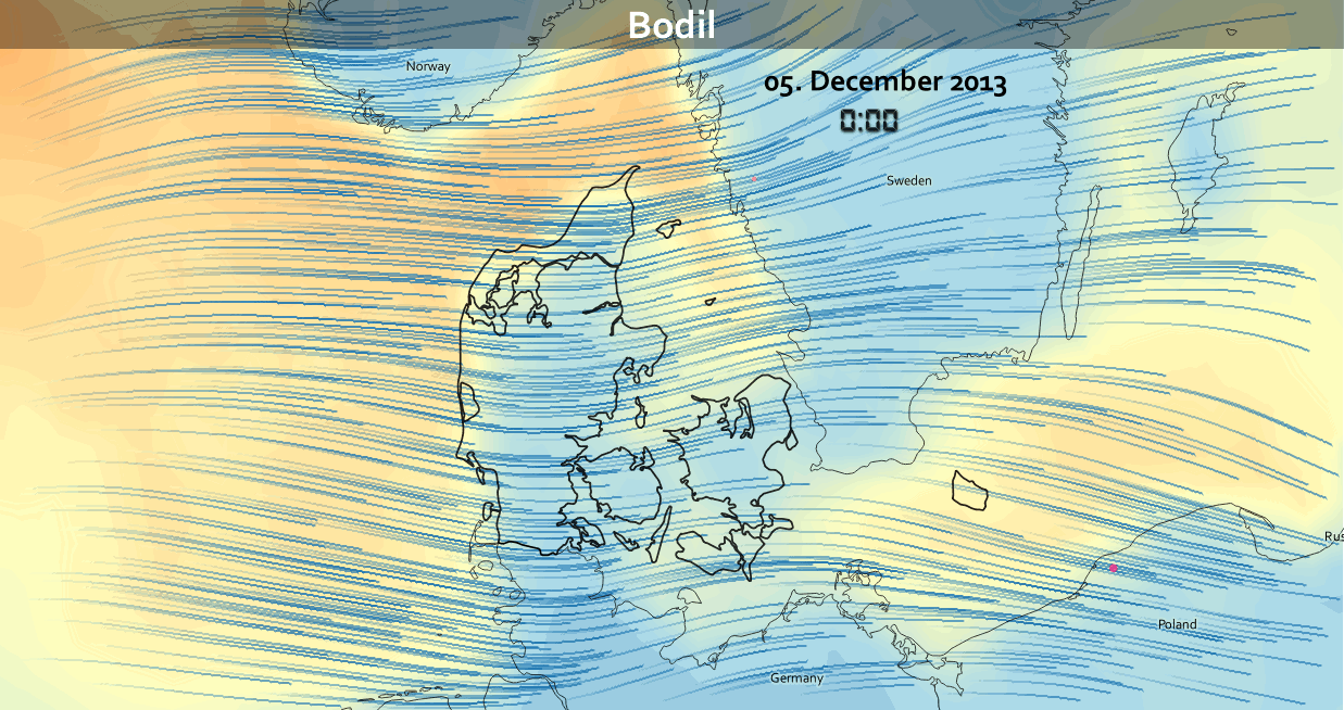
Day 27: Heatmap
An animation of one of Denmarks largest storms - Bodil in Dec. 2013 - Made in QGIS with mesh data from Copernicus EU & a heatmap of lightning strikes - data from DMI.dk. Working with mesh data is also covered in the upcoming Data Visualization with QGIS course course.
Day 28: The Earth is not flat
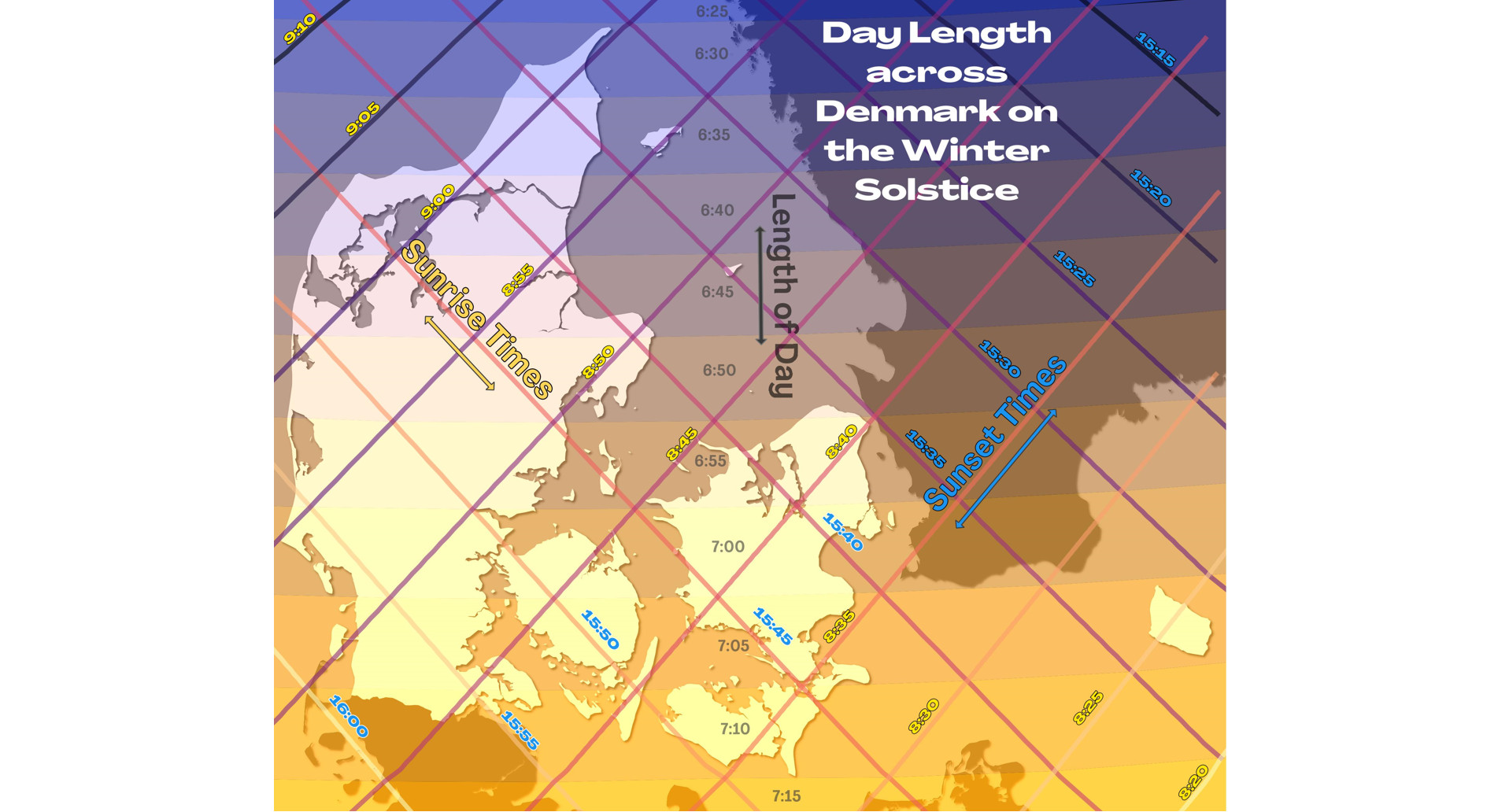
I’m fascinated by the pattern of sunrise & sunset times in the northern latitudes. Inspired by
Evelyn Uuemaa’s work, I created this map of the Day Length across Denmark on the Winter Solstice.
I used QGIS & the Date/Time Tools plugin. This is one of my personal favorites.
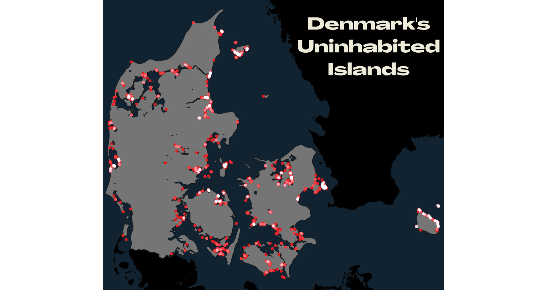
Day 29: NULL
Denmark’s uninhabited islands.
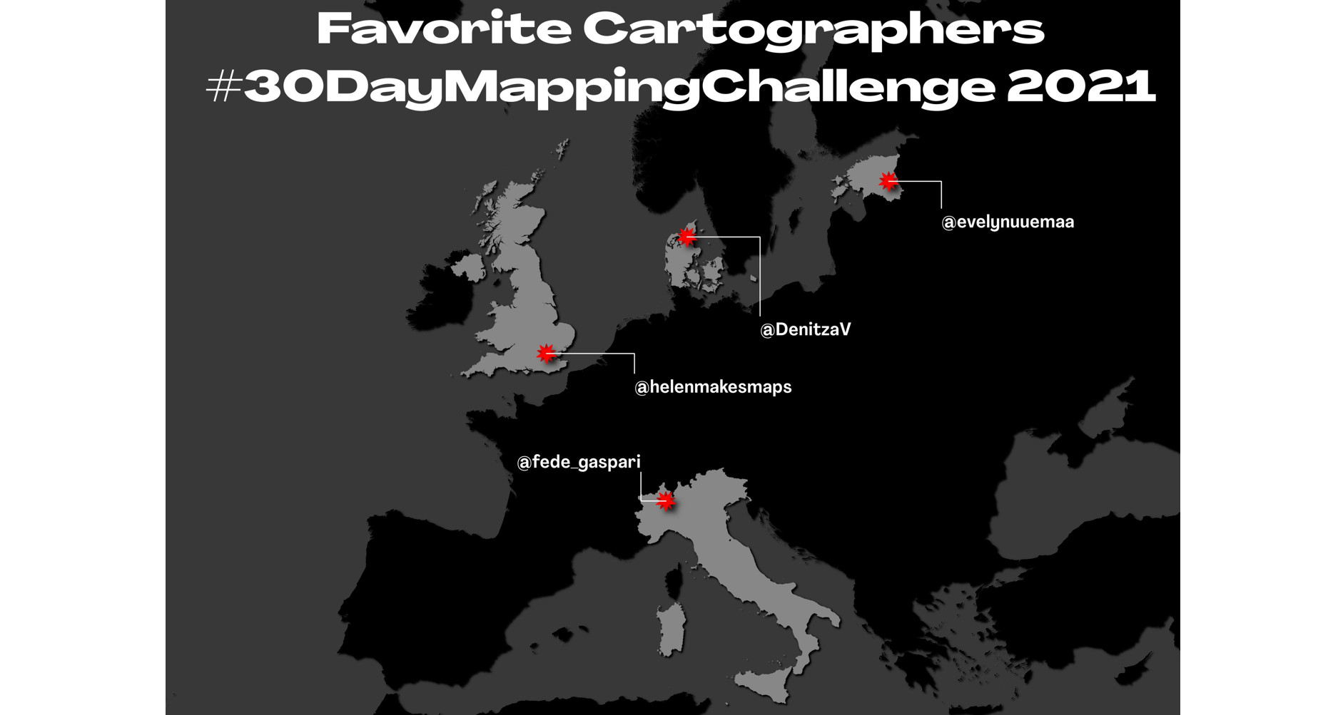
Day 30: Metamapping Day
A map of where of some of my favorite cartographers from the 2021 #30DayMapChallenge are located. Do yourself a favor and follow
@evelynuuemaa - @helenmakesmaps - @fede_gaspari & @DenitzaV! And look at their amazing maps!
Want to learn more about data visualization and cartography with QGIS?
If you are interested in learning more about data visualization and cartography in QGIS, then sign up for the Data Visualization with QGIS course, which starts on 7.February, 2022.
We also have a large number of other QGIS courses, you can read more about them here.